Tuesday, December 31, 2013

A Wonderful Trip to Hawaii, Part 2. Maui


First of all, Happy New Year everybody!

So in day 4, I was at Maui Island where I spent the most of my time during this trip, because everything here is soooo beautiful!.

When I saw the whole island from the airplane, I felt like this island has much more diversity of landscape than the big island, field and mountain, beach and cliff. Driving all the way to the south, Hana, I was too sick of the mountain road where the likely falling rocks on the right side and steep cliff on the left side. But I have to say that the vegetation is so diverse and the natural fresh air made me dive into the forest. Hana Bay is just a small bay and I thought it was not worth driving this much long. When heading back, I was stunned by the stars and milky way above my head. I haven’t seen these amount of shining stars in my life and the airplane also looked like a shooting star. I turned off the car and enjoyed the present of god. All I could hear is the water beating the rocks and the bird tweets. Everything was so sacred and peaceful and I felt myself too small to be a mankind in the galaxy. I saw Venus if I was right. I couldn’t capture the spirit by using a camera so I just was watching and watching...


Copyright by Yubin Wang
Starry sky at Hana
Next day, I spent whole day getting tanned on the beach. The northwest of Maui Island is a nice place to drive while enjoying the beach view. Kapalua, Napili and Kaanapali area are the best place to go surfing. Speaking of surfing, everybody should move to Hawaii and live a surfing life, seriously. The natural waves are so perfect for anyone who loves to fly on the sea!


Copyright by Yubin Wang
Napili Beach
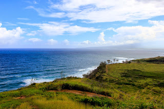
Next day, I was on my way to Nakalele Blowhole that locates in the northeast of the island, unfortunately the road was closed, but you cannot believe that the unpaved road is so worth driving. Each turn was so thrilling for there were falling rocks on the left side and cliffs on the right side. Once I arrived the deep of west Maui forrest, I was kind of understand why so many people withdrew from society and ended up with living in the mountains. There are no distractions, gimcrackeries, pollutions, bustles and whatsoever. It is so easy to hear yourself and your breath.

Copyright by Yubin Wang
West Maui
Then I went to Lahaina historical district. I just didn't fall in love with those commercialized stores and restaurants that forces you shopping. There were a lot freelance artists who set booths selling their works. The Bubba Gump Shrimp Co. was there and I had a nice dinner. I almost forget to say the sunset. Every sunset I've seen here was so amazing like nowhere else could share the same thing.

Copyright by Yubin Wang
Sunset at Lahaina 
Last day at Maui, I sailed off to Molokini Crater snorkeling in the morning.When I jumped into the water, only a small amount of tropical fish was moving around. I got kicked as too many people were in the water at same time and some of them couldn’t even swim! I was unable to see the turtle because the water was so cold. Then went to Haleakala National Park to watch the sunset, I had to say that this was the most beautiful sunset I have ever seen! The sun was going down little by little, and everything was turning into orange red. The soft clouds were like marshmallows. You could actually feel like you are in the air.

Copyright by Yubin Wang
Sunset at Halealaka
More pictures, please visit Yubin Wang Photography

To be continued...

All rights reserved by Artist Day 1 to Day 100

Monday, December 30, 2013

A Wonderful Trip to Hawaii, Part 1. Honolulu-Big Island


2013 was a tough year. There are ups and downs, laughs and sobs, awesome adventures and deep regrets. So, I decided to treat myself a once-in-a-lifetime trip, the trip to the wonderland.


Here are my basic schedule during the trip:
12/15 Honolulu, O'ahu
12/16-12/19 the Big Island
12/20-12/23 the Island of Maui
12/24-12/26 Honolulu

After I landed on Honolulu International Airport, I took the city bus to Waikiki Beach that is near my hotel. It was in the evening but the city was so busy and alive. Travelers, restaurants, hotels, bars, and souvenir shops, they were running through all over the place near Waikiki area, making my following trip more exciting. Later on, I realized my overexcitement due to the long time living in Texas...

Next morning, I walked along the Waikiki Beach as my hotel had a super nice location! I got to see the Duke's Kahanamoku Statue which surrounded by many tourists. Having walking on the beach, I suddenly saw an old couple holding hands in the water and I felt so warm even it was like summer.

I had to catch the flight from O'ahu to the Big Island so I left Honolulu early in the afternoon and I would come here again in Christmas Eve!

Copyright by Yubin Wang
Waikiki Beach
Copyright by Yubin Wang

Next day, I woke up early in the morning and headed to Hawai'i Volcanoes National Park where is located at the south of the big island. Due to the active movement of the volcano, all the hiking trails to lava were closed. Driving was the only way to go around the park. The world's biggest active volcano is here! It was not really active as I expected though. In the evening you may see the red lava coming out if the vent of the volcano but not in the daylight. There are several sightseeing spots all over the park. Most of them are the lava remains in recent historial time. The weather close to volcano was not stable, sometimes raining and sometimes sunny. The amazing one to me is the one goes into the ocean. I climbed onto the cliff where the lava goes into the sea and I felt I see the end of the world as the the sky and the sea disappear into the same horizonal line. The wind was quiet strong at here. I almost got blew away. 


Copyright by Yubin Wang
Mauna Loa
Copyright by Yubin Wang
Apua Point


Copyright by Yubin Wang
Plants inside the lava flows
Driving all the way to the south, I arrived at Black Sand Beach. It is the best place to see lazy turtles and unsurprisingly, I saw to turtles lying on the beach, which was really funny at first because the tourists seemed more happy than the two turtles!

Copyright by Yubin Wang
Black Sand Beach

Copyright by Yubin Wang
The two turtles
The next day, I was supposed to see Mauna Kea, the highest spot here and a good place to watch stars at night. The Web Cam showed that there was snowing which was so weird and the road was closed. Also I could't find the way to Captain Cook after following the GPS. When driving to Mauna Kea, I found out the diversity of vegetation in Big Island. Coconut palms grow along the beach and dry grasses grow on the mountain. After failed to follow the plan, I decided to drive to the south of Big Island. So pretty much got to see all the view there.


Copyright by Yubin Wang
The road to Mauna Kea

In the afternoon, my first time air tour happened! The small plane took me to the popo oo volcano. The pilot drove as close as possible to the vent of the lava flows. I could see the burning trees right down my feet. The black and grey lava was evading the forests little by little and the trees had turned into dry barks after got influenced by the air movement above the lava. I really had the hard time on the plane as I had the fear of height and hated the felling of falling down. I kept imagining what I would be like if I was skydiving...

Lava flows
More pictures, please visit Yubin Wang Photography


To be continued...

All rights reserved by Artist Day 1 to Day 100


Friday, December 13, 2013

Day 5: Landscape-Scotland, Oil on Canvas


This Sunday I will head out to Hawaii with my friend who is coming from London!I'm so excited because we will stay in Honolulu at Christmas Eve! I started wondering what kind of present I should give him as the Christmas gift. I remember that he was so fond of Scotland when he was traveling there, so I looked up some photographs of Scotland and began to paint!

Copyright by Yubin Wang
Scotland, Oil on Canvas
The painting above was still unfinished. It took me three weeks as I had to let it dry every time before I put a new layer on it. Anyways, this is my best oil painting so far!

Also want to share some landscape oil painting techniques with you:


Saturday, December 7, 2013

Ice Trees and Power Outrages in Dallas


My room is like a ice box right now due to the icy weather and power cut-off. I spent a hour got my car de-iced, and experienced a exciting driving adventure on the slippery road. It's so wired that North Dallas is having a such snowy and icy weather this winter.  I found a safe and warm place at school and started to show you the most severe and beautiful weather in Dallas!


Tuesday, December 3, 2013

Day 4: Figure Drawing Techniques

Charcoal 18x24
Pencil 9x12

I've been practicing portrait and figure drawing for a while, and I find myself pretty good at capturing the beauty of human.The two drawing above are what I did in my drawing class.The very top one was done by charcoal which is an amazing media creating great values between black and white. It turned out to have really dirty hands, but the process was enjoyable. Except for the outline of the female figure I drew the values by my fingers. I left the area that was the brightest and created the little details with fingers rubbing the paper. One good thing about charcoal drawing is that it could give what you want right away. With the saturated black and pure white, you will draw the most beautiful values on the paper. The next one was done by pencil and not like charcoal, pencil drawing needs more time to develop 3D effect.The teacher told me that I should have the basic outlines before I start the details like eyes and hands and that I can always exaggerate the features of female like the breast and waist.

I highly suggest you to try charcoal sometime!

Also I find that there are tons of drawing techniques out there. I'd like to share some of them with you.

Figure drawing from life using the reilly techniques online class(Free):
https://www.udemy.com/figure-drawing-from-life-using-the-reilly-technique/

My drawing tutorials:
http://mydrawingtutorials.com/category/figure-drawing/

The Human Figure(Dove Anatomy for artist):
a really classic book, you can find it at Amazon for $7.16.


Sunday, December 1, 2013

Digital Marketing: Buying Art Online Is Here to Stay


A piece of art news I found out today, I thinks it's a good message for artists who selling their art works online.


"In early August, Amazon launched its second entry into the art category with Amazon Art, promising fine art to the masses at reasonable prices. With the new marketplace, you don't need to leave your bedroom to peruse or purchase. In fact, it's downright convenient.
Amazon Art is the culmination of the digitization of art commerce. In just a few years, over 300 online art selling/buying platforms have launched, with the category trying to catch up with demand. And the demand is there. Fully, 71 percent of art collectors have now purchased art of some form online. Now, more than ever, art is becoming less physical, evolving into a more accepted digital-first experience.

This shift is largely representative of our culture's habituation to shopping online. According to a recent UPS study, 70 percent of more than 3,000 online shoppers surveyed in February 2013 say they prefer to shop their favorite retailer online. Beyond shopping, look at online dating. 22 percent of heterosexual couples and 61 percent of same-sex couples report having met on the web. Doing things online is the norm.


Buying art -- which some would argue can be as difficult as dating -- has now been added to the list.


But there's more to the picture here. Yes, selling and buying art online has benefited from an online shopping trend that has been ongoing for years (led by none other than Amazon). But, the migration of the art experience online has actually helped address longstanding issues that hindered artists from succeeding and art collectors from buying.


Here are some of the more noticeable advantages we're seeing from the shift toward online art.


2013-09-10-Large_fioridiprimavera.jpg
Gloria Blatt's Fioridiprimavera. Still from UGallery.
For collectors -- art demystified

Let's be honest; prior to the digitalization of art buying, art culture was often seen as a private club, only accessible to deep-pocketed collectors with a rarefied pedigree. The traditional brick-and-mortar gallery is actually the physical manifestation of this ethos, as only an exclusive few artists are represented, with their art typically pricing them out of the everyday buyer's budget. This is why you'll often hear those outside of the traditional art community labeling galleries and art houses "intimidating." They seem inaccessible to novices who are genuinely interested in art, yet unsure how to find quality work. The art community has built an elitist reputation that has hurt its ability to organically expand and sell artwork on a larger scale over the long term.

Today, however, online art platforms are disrupting and reversing the old order. Services like Amazon Art, UGallery and others are breaking down the traditional barriers to entry for buyers and demystifying the purchase process. Rather than visiting a physical gallery without insight into pricing or the artists they have on hand, you can visit a curated online gallery and browse thousands of pieces with all the information you need on the artist involved. It's not a nerve-wracking experience by any means. You can take your time to learn, without expectations or pressure. There's transparency enabled through online galleries that make buying a whole lot easier.

Online galleries also represent more artists, meaning larger inventories and a more varied collection, with different price points for any budget, making art more accessible than ever.


For artists -- sell and be seen


Prior to the launch of the online art gallery, to be successful and carve out an actual career, artists needed to develop close relationships with physical, brick-and-mortar galleries and art houses to help market their work, drive sales and establish credibility. This is easier said than done, of course.


Galleries are notoriously sensitive about the artwork they take on and the artists they ultimately represent, with only a small percentage eventually breaking through. For those artists who don't have physical gallery representation or just aren't located in an area with any galleries -- this happens quite a bit -- an online gallery is the perfect partner. And while some online galleries curate their collection like a traditional gallery, from a sheer physical space standpoint, online galleries aren't limited and are inherently designed to take on more inventory. Plus, in a world where over 70 percent prefer buying online, online galleries, unlike their physical counterparts, are masters of digital marketing to drive real sales.


Moving beyond the accessibility factor, online art galleries offer unparalleled, global scale for artists in a way that traditional galleries can't. Now, an artist based in Michigan can sell a piece to a collector in China. In the past, reaching New York and international markets was a struggle for all artists. Thanks to platforms like Amazon Art, artists are selling worldwide, regardless of location.
2013-09-10-Large_DSCF3231.jpg


Suren Nersisyan's Street in Washington DC (Midday). Still from UGallery.
Online art & physical galleries coexisting
While I'm clearly a proponent of the digital art experience, both an online presence and an offline one are necessary for the art world to expand its' base successfully. There will always be the affluent art patron who has cultivated valuable relationships with gallery experts and who prefers to see the work in-person before spending thousands or even millions on an original piece.
Online galleries, on the other hand, support the needs of a previously underserved market of artists and a new generation of art buyers. They're opening up a previously closed channel and bringing "art to the people" in a more personal, accessible and convenient way. Market penetration for original artwork is still relatively small; most people start with prints, where they may naturally feel most comfortable. But the opportunity provided through online art to spark real growth for original work has never been greater."

Saturday, November 30, 2013

David Hockney: Always distinctive and versatile


"David Hockney was born in Bradford, Yorkshire in 1937 to a working class family. He went on to a prize-winning career as a student at the Royal College of Art. It was there that he met fellow artists such as R.B. Kitaj, Peter Philips and Patrick Caulfield, who were to become stars of the British Pop Art Scene. By his mid-20s, Hockney had already become one of the most critically acclaimed contemporary artists in Britain. At only 26 he had his first one-man show and in 1967 was awarded first prize in the John Moores Exhibition.
Hockney worked in a variety of fields as a painter, draughtsman, printmaker, photographer and designer. As well as the versatility of his work, he is also known for his exuberant personality, easily recognisable with his trademark circular specs. Although he rejected the label 'Pop', much of his work contains references to popular culture and contains a good deal of humour. The Californian swimming pool was one of his favourite subjects, indicating his love-affair with Los Angeles and most memorably featured in the painting 'A Bigger Splash' (1967). In the Seventies his style became more traditional with a series of portraits of couples such as 'Mr and Mrs Clark and Percy' (1970-1971) and ‘My Parents’.
Hockney is also a celebrated graphic artist, etching illustrations to Cavafy's Poems (1967) and Six Fairy Tales of the Brothers Grimm (1969) for example, as well as individual prints often on homoerotic themes. In the 1970s he became popular as a stage designer for productions such as Stravinsky's 'The Rake's Progress' (1975) and Mozart's 'The Magic Flute' (1978) both at Glyndebourne. Photography was Hockney's main preoccupation in the 1980s, with his experimentation of complex, Cubist-like photomontages, but throughout his career painting remained his prime concern.
Picasso was one of Hockney's role models in his demonstration of creative freedom and original thinking. "Style is something you can use, and you can be like a magpie, just taking what you want. The idea of the rigid style seemed to me then something you needn't concern yourself with, it would trap you." David Hockney. In addition to his art, Hockney has also published two books on art, David Hockney on David Hockney (1976) and That's the Way I See It (1993). "
--Artpublic.com
My parents, 1977
.
Peter getting out of Nick's pool, 1966
.
The road to York through Sledmere, 1997
For more painting information, please go to David Hockney


Friday, November 29, 2013

Day 3: Photo Ideas-Tasty Food Photography


I've been playing with my Cannon EOS T2i for three years. It's a really good SLR camera for beginners, not expensive, light and high quality. Some of my professional friends told me that having a high-end camera doesn't really matter compared with having the great lens. So I followed their advice as a kindergarten kid. The lens that has both wide angle and large aperture is my preference, so I bought Cannon 17-40mm f/4.0. This lens was becoming my favorite tool when shooting portrait and landscape. To get superb wide angle effect and appearance out of focus background, I can zoom in and out by adjusting the aperture and essentially I don't have to change my lens to achieve different effects. Nonetheless, I admit that if you want the sharply defined image with nicely blurred background 17-40mm wouldn't win the medal. For newbies and people who like photographing but don't have money to store different types of lens, Canon 17-40 mm f/4.0 is my first recommendation.

Speaking of shooting food, it's a easy but tough job. For easy, the object is still and well-displayed, and mostly indoor. For tough, natural light is not always sufficient and focus could be so soft that the picture doesn't deliver the meaning what photographer wants.

Here are some food photography I've taken:

Copyright by Yubin Wang Photography


Copyright by Yubin Wang Photography


Copyright by Yubin Wang Photography


More food photograph, please visit my portfolio

Food photography is always fun as you get to eat the subjects after you've taken the shots. I'm going to show you a few simple photography tips.

Use natural light

Natural light can be lovely for food shots but you need a lot of it to bring you color and contrast. By shooting next to a large window or consider to take your dishes outside to photograph them.

Better flash

A flashgun can supply the light you need, but it's prone to producing "specular lights"(unwanted small, very bright spots).Try bouncing the flash off a sheet of white card instead of firing it directly at the food.

Composition

It's usually best to be minimal with composition but a couple of props, such as quality crockery or fine cutlery, can add to the shot. Use them sparely and choose items that suit the mood you're aiming to convey.

Go geometric

Strong geometric shapes work well, so keep this in mind when cutting food and arranging it together on the plate prior to shooting.

Add garnish

Blandly colored food, such as bowls of pasta, can look particularly unappetizing. An easy way to liven up less visually interesting dishes is to simply add some colorful garnish

White Balance

Different manual White Balance setting, such as Daylight, Cloudy, Shade and Tungsten, can add trendy color casts to make shots look more dynamic.

Selective focus

A small depth of filed, where only a small part of the dish is in focus, can work really well. Use a macro or long telephoto lens at a wide aperture for best results.

Bump up the color

For real color impact, increase the saturation setting in a Custom Picture Style, or do this after the event in a program such as Digital Photo Professional or Photoshop Elements.

Hot shots

If food is supposed to look hot, it should be steaming. Get everything set up first so that you're ready to shoot food straight from the oven.

For more information, please visit Photography Tips


Thursday, November 28, 2013

Edward Hopper: The Color of Light


Currently, Dallas Museum of Arts is hosting a exhibition-Hopper Drawing:A painter's process, which shows the drawing process of the American realist artist, Edward Hopper.

Edward Hopper was born in New York. His art works have been described as calm, silent, stoic, luminous, and classic.

In one of his most famous piece, Nighthawks, four customers and a waiter are in a bright diner in the evening. He created it during the wartime, and many people thought the four customers were blocked by the waiter and the world outside, which demonstrated the feeling of most americans during that time.

1942 Nighthawks

In the exhibition of Dallas Museum of Arts, the creative process of Morning Sun is on the show. You get to see the painting the way the artist did when he'd just put down his brush.

1952 Morning Sun

1932 Room in New York


1951 Rooms by the Sea
.
1940 Gas
.
1940 Office at Night
.
1939 New York Movie

.
1929 Chop Suey
For more painting information please visit Edward Hopper Gallery and Dallas Museum of Arts


"To me the most important thing is the sense of going on. You know how beautiful things are when you're traveling.”-Edward Hopper

Wednesday, November 27, 2013

Day 2: Still life, pencil 18X24


This drawing in pencil was finished in this summer at home. I put an empty bottle, a flour bag and an apple on the table, and made the light coming from the left side. The room was pretty dark. As the light was shooting right beside the subjects, the transition of values were weak.The pencil I was using was HB pencil, which couldn't help me add more values in the shading process.

Practicing still life is always fun to me, for it teaches me how to see and observe the objects from an artist perspective. All you need are a 2B pencil, an eraser and cartridge paper.

Here are some very useful still life techniques in artyfactory.com:

Step 1: Starting the Still Life Drawing

Step 1: Starting the Still Life Drawing
TECHNIQUE: In any still life, you should start to draw the objects as if they are transparent wire frame forms with visible lines of construction. This technique helps you to be fully aware of the shape of each individual form and its position in relation to the other forms. It is important to sketch the objects lightly as this makes it easier to change any mistakes and erase any lines of construction.
NOTE: This see-through drawing technique uses vertical and horizontal lines of construction to help you to draw convincing ellipses and to balance the symmetry of cylindrical forms.

Step 2: Creating an interesting composition

Step 2: Creating an Interesting Composition
TECHNIQUE: When composing a still life, try to introduce the qualities that make an interesting arrangement. You need to be aware of the abstract structure of your arrangement: its rhythms and contrasts of line, shape, tone, color, pattern, texture and form.
NOTE: A transparent wire frame approach to sketching the still life helps you to organize the composition of the group. It makes it easier to see the shape, position and proportions of each object in relation to its neighbours.

Step 3: Erasing the lines of construction

Step 3: Cleaning up the Image
TECHNIQUE: Once you are happy with the shape, proportion and composition of the still life, you can erase the lines of transparent construction. This will leave you with an accurate visible outline of each form and the confidence that all the objects are positioned correctly. You are now ready to work on the details of each object.

Step 4: Adding the details in line

Step 4: Adding the Details in Line
TECHNIQUE: Now lightly sketch in the shapes of any shadows or reflections onto each object.
NOTE: The more care you take over the accuracy of these marks, the easier you will find the next stage of the drawing - the Application of Tone.

Step 5: Shading Technique - 1

Step 5: Shading Technique Stage 1
TECHNIQUE: The tone of our still life is built up in four stages outlined in steps 5 - 8. In this step, some basic tones are lightly applied to each object to help build up its three dimensional form.

Step 6: Shading Technique - 2

Step 6: Shading Technique Stage 2
TECHNIQUE: The second stage in building up the tone focuses on the spaces between and around the objects.
NOTE: The drawing of the light and shade between the objects must be treated with as much importance as the drawing of the objects themselves. The shadows cast beneath and around the objects add as much to the definition of their shapes as does the shading on their surfaces. Notice how the counter-change of tones between the objects and the spaces takes over from the use of line to define the forms of the still life.

Step 7: Shading Technique - 3

Step 7: Shading Technique Stage 3
TECHNIQUE: In the third stage of building up the tone, you focus back on the objects. This time you deepen their tone, increasing the contrast between the areas of dark and light. This will enhance the form of the objects and increase the impact of the image.
NOTE: The biggest problem at this stage is maintaining a balance of tones across the whole still life so that no object appears too dark or too light. You are searching for a unity of tone and form.

Step 8: Shading Technique - 4

Step 8: Shading Technique Stage 4
TECHNIQUE: Finally, you focus again on the spaces between the objects, deepening their tones and increasing their contrast.
NOTE: You need to be careful in balancing the tonal values of the objects and the spaces between them to ensure that you create a unified image.
THE FINISHED STILL LIFE: The completed still life should work on two levels: as a realistic representation of the group of objects and as a dynamic composition of visual elements, harmonizing and contrasting the use of line, shape and tone.